
Flags have existed for thousands of years and have gone through various changes before becoming what we know today. They first appeared in antiquity for military purposes in the form of standards (a military flag carried on a pole) such as those used by Roman legions. Rectangular flags made of cloth first appeared in the Indian subcontinent and the Chinese Zhou dynasty (1046-256 BCE), but they entered the mainstream during the Age of Sailing in the 17th century when flags were customarily used to denote a ship’s nationality. It was not until the rise of nationalist sentiment by the end of the 18th century that flags began to commonly represent countries and other levels of government. Nowadays, businesses, sports teams, and even schools may have their own flags.

Evidently, flags perform a very powerful function as they hold great cultural, historical, political, and social significance. Thus, it is in a flag designer’s best interest to ensure their flag can optimally fulfill its representative function. However, what makes a flag a “good” flag? A design might look great on paper, but one must consider how the flag will look when it is high in the air, waving in the wind, or drooping down when the air is still. People around the world interested in vexillology, the study of flags (from the Latin vexillum “flag” or “banner”), have come together to discuss this question. The North American Vexillological Association (NAVA) gathered the wisdom of various scholars who have written on optimal flag design throughout history and condensed their ideas into 5 principles in their book “Good” Flag, “Bad” Flag.
Using the words of Ted Key, the NAVA member who compiled the book, it is important to keep in mind that “design principles are guidelines, not rules—they help designers create flags that will be effective, widely adopted, and loved.” Undoubtedly, there are flags that do not follow the five principles, yet are still effective and beautiful; in some cases, flag designs depart from the guidelines to reach a creative, compelling, or politically acceptable solution. So a flag that does not adhere to the following five principles does not necessarily mean it is poorly designed.
The five principles are:
1. Keep It Simple.
The flag should be so simple that a child can draw it from memory.
2. Use Meaningful Symbolism.
The flag’s images, colors, or patterns should relate to what it symbolizes.
3. Use 2 or 3 Basic Colors.
The basic flag colors are red, blue, black, yellow, and white (you may ask why, but that’s another article). More than four colors may be hard to distinguish and could make the flag unnecessarily complicated and expensive to reproduce.
4. No Lettering or Seals.
Letterings are nearly impossible to read from a distance, hard to sew, and are not reversible (meaning the flag must be double-sided or the words will be mirrored on one side). Seals are rarely effective on flags since most are quite detailed and meant to be read at close range. It is better to use some element from the seal as a symbol.
5. Be Distinctive or Be Related.
Avoid duplicating other flags, but use similarities to show connections.
The fictional flag below for the Polar regions titled “Polaris” created by Reddit user 4dpsNewMeta is a good representation of these principles. It is easy to draw with its simple but unique design, 3 total colors, no complicated letters or seals, and the symbol of the north star is clearly symbolic of the North Pole.

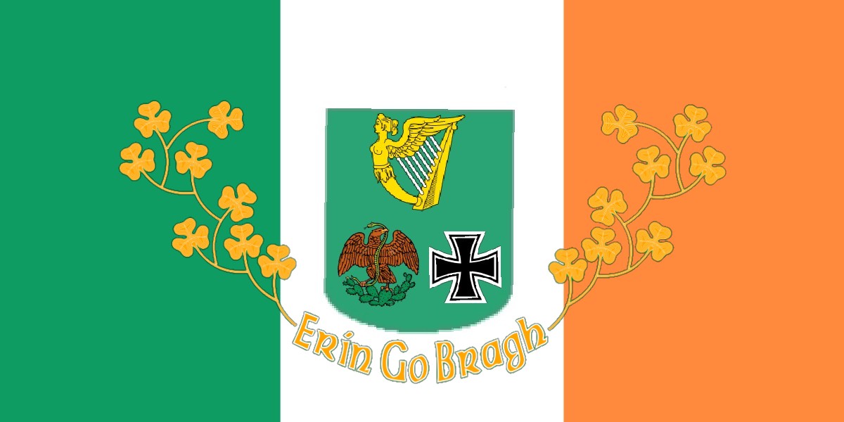
This fictional flag of Ireland by Reddit user Brams277 doesn’t follow the principles and may not be the most effective flag. Although the graphic elements of the Celtic harp, the Celtic cross, the clovers, and the eagle have important Irish symbolism, none are large enough to be seen easily from the top of a flagpole. Moreover, the additional brown and black coloring creates unnecessary cost and complexity, and the orange words are too small to distinguish if the flag is waving.
Is the flag of Blair academy an effective flag?
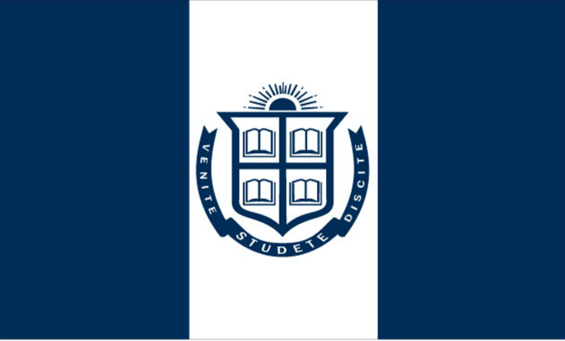
Blair’s flag adopts the classic tri-band format which has an appropriate significance: the design originated in the 16th century as a symbol of liberty and revolution. It utilizes just two contrasting colors, navy (#082c5c) and white (#ffffff). Blair’s seal is in the middle as a distinguishing marker; the details of the seal such as the demi-sun charge, the open books, or the moto may not be readable, but the general meaning of the seal is still recognizable to people familiar with Blair Academy. All in all, Blair’s flag follows all five design principles for a “good” flag except for including a seal. What do you think about Blair’s flag? Could you design something better?